FAQ pages - that’s short for Frequently Asked Questions - are a must for any business.
Not only do they let customers look for answers themselves - which means you’ll spend less time answering support queries - but they also improve your search engine rankings. A good example of that is that they can help you get into Google’s “Rich Snippets”, which are an incredible source of organic search traffic.
In short, here’s what you need to nail down if you want a top-notch FAQ page:
Update your FAQs constantly
The questions your customers have are changing all the time, and that’s why it’s so essential to update your FAQ all the time. A good way to know which questions you should be answering is by setting up analytics on search queries that do not return answers. This way, you’ll know what your users are looking for and not finding
Don’t limit yourself to your own FAQ
Your competitors also have their own FAQs - and the questions they answer there may very well be valid for your website. Use their FAQs combined with data sources such as Answer the Public to make your FAQ extremely useful.
Follow a well-thought information hierarchy
This step is crucial - and also where many FAQs fail. Consider accordion FAQs and multiple categories to make your FAQs easy to digest. Not only that, but make sure they’re optimized for SEO, making use of schema, ensuring high page speed, and designing for mobile devices.
Either way, taking a look at the top FAQs out there helps you get inspired. Read on and find out more:
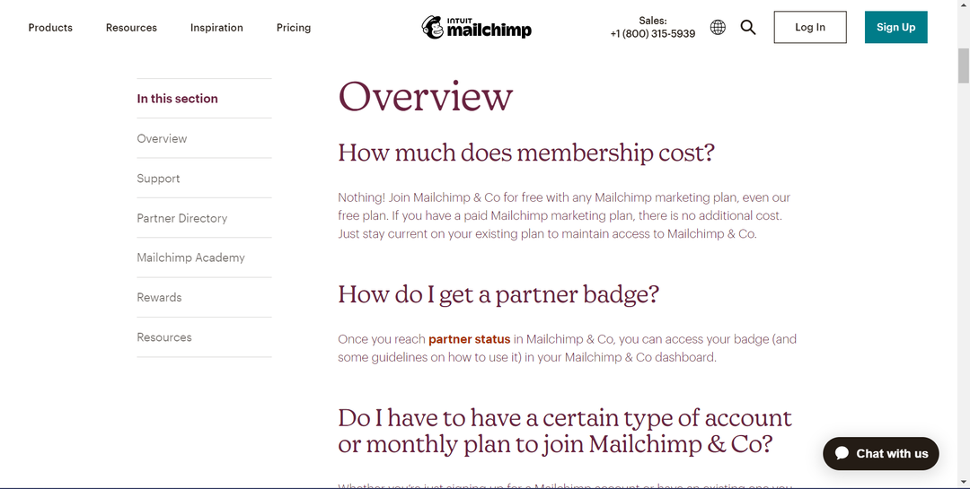
1. Mailchimp
Whenever you write your FAQ, make sure it sounds friendly. Mailchimp’s FAQ is a good benchmark for what you should aim towards.
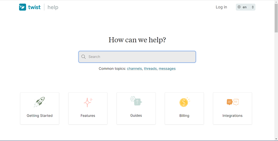
2. Twist
Talk about looking good! This FAQ looks calm and relaxing, clearly reflecting their brand values.
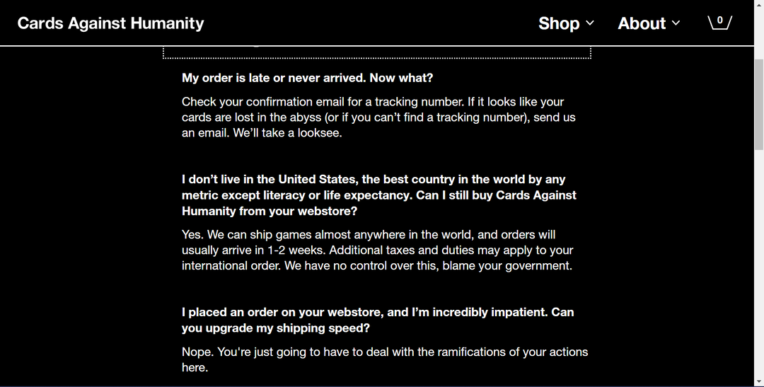
3. Cards Against Humanity
A touch of humor can go a long way. For Cards Against Humanity, it made complete sense to add it. The lesson? Don’t have a boring FAQ. Don’t forget that users browsing FAQs may be frustrated with your product, so easing some tension away can help mend the situation.
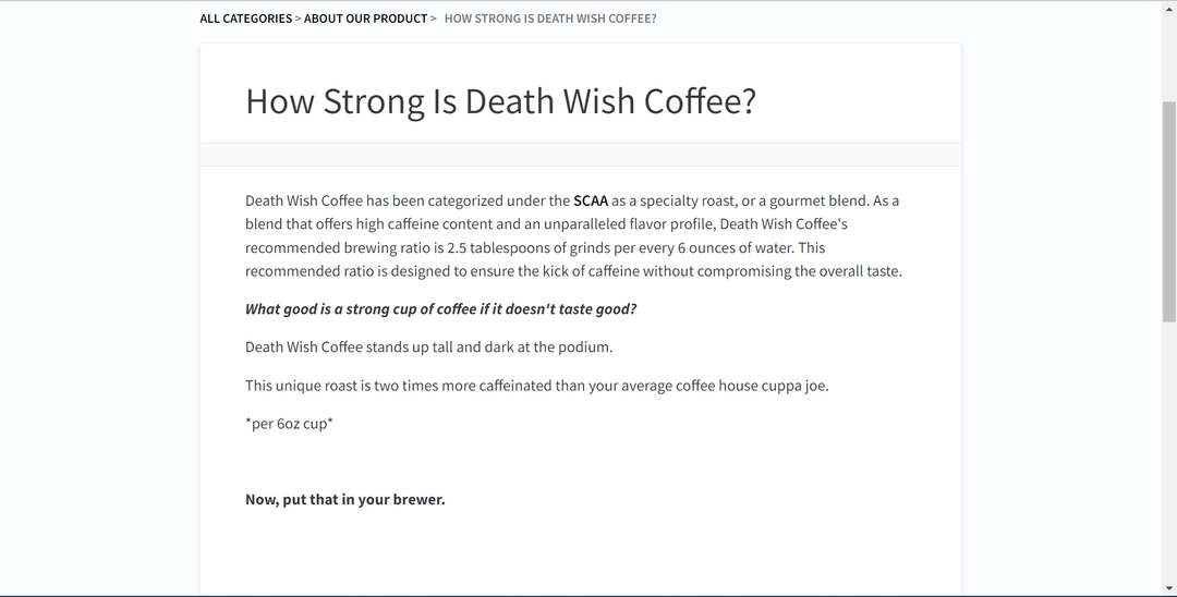
4. Death Wish Coffee
FAQs can also be a good opportunity to reinforce the benefits of your product. This is the perfect example of that.
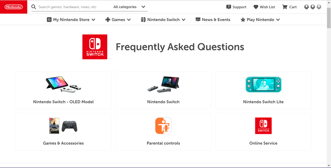
5. Nintendo
The game industry giant has a simple-to-use and easy-to-skim FAQ. A perfect combo.
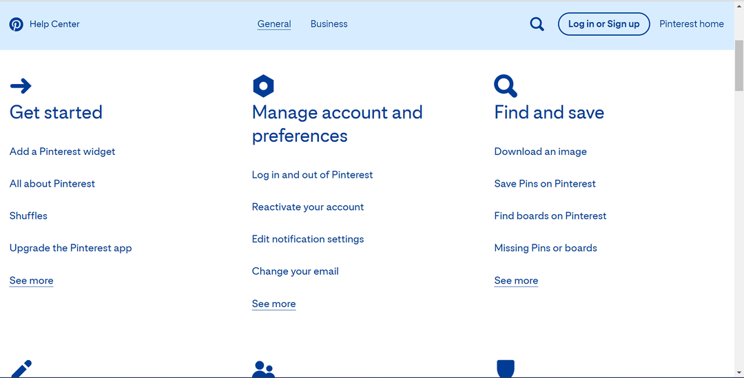
6. Pinterest
The focus lies clearly on the mobile user, a clear indication of Pinterest’s focus.
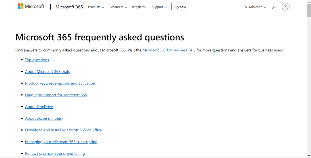
7. Microsoft
Notice how they added a "Top Questions" section. Prioritizing your Q&As to highlight the most asked questions is a great way to improve the value of your FAQ.
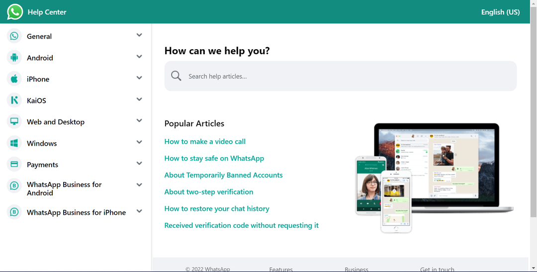
8. WhatsApp
Clean and simple to use, WhatsApp is the go-to for layouts that focus on good information management.
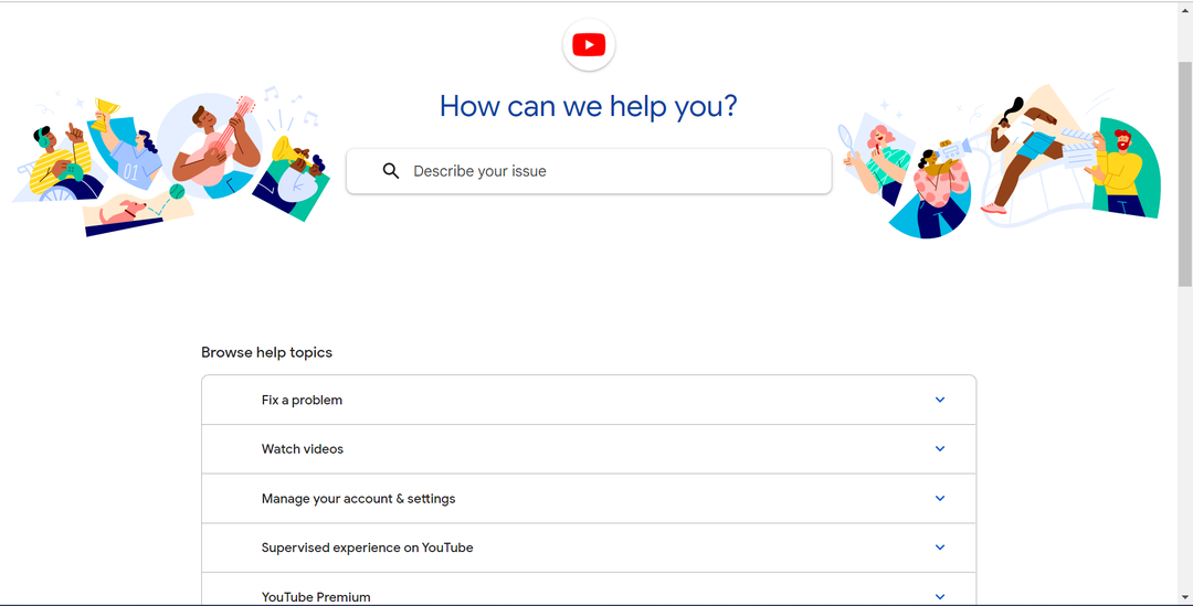
9. YouTube
The column layout makes this FAQ a winner in the minimalistic FAQs category.
10. Netflix
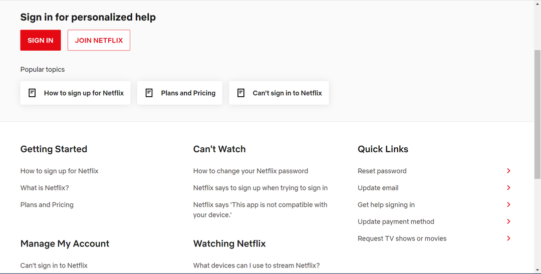
The column layout helps users quickly find the category they need to browse to.
By optimizing your Frequently Asked Questions section on your website, you can easily help your audience find answers and avoid some customer service issues in addition to helping your website rank in more search results.
