I love this tip. Why? Because it's a mix of psychology, SEO, and good UX.
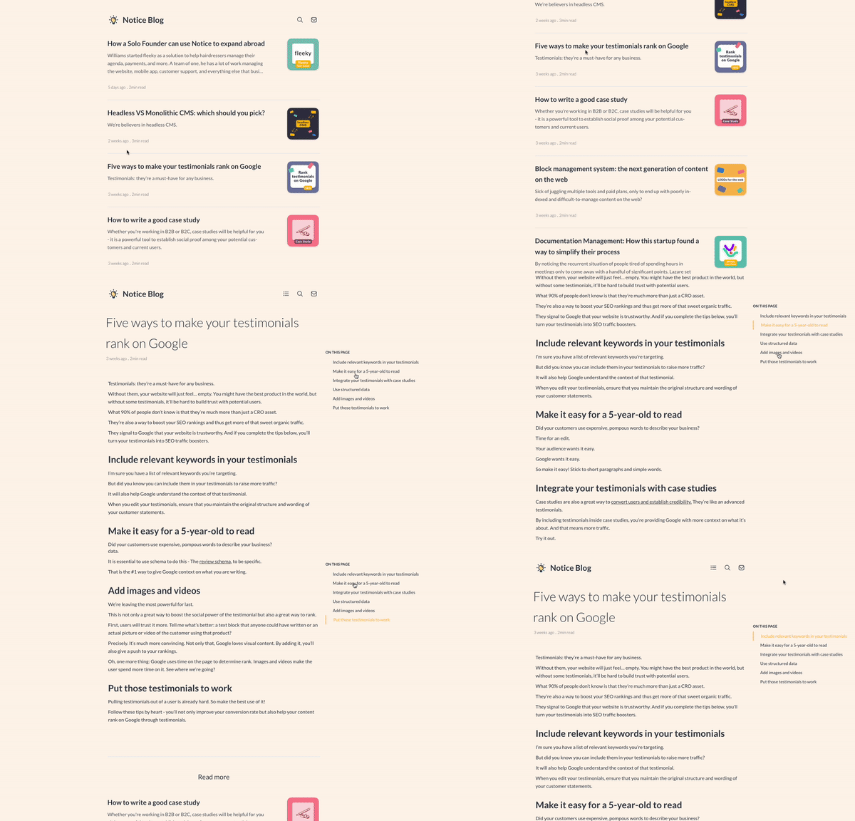
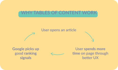
We've found that tables of contents are a great addition to any blog. Users feel less overwhelmed with them and bounce less. It increases time on the page, which in turn leads to better search engine ranks!
An effect that has been proven by Pat Walls. He saw a 260% increase in average session duration thanks to this!
Here's why it works:
The Psychology Behind a Table of Contents
Picture this:
You click on an interesting title on Google or Twitter and land on a blog article. You notice it's over a thousand words long.
"Urgh. I'll read it later."
You procrastinate and drop out.
Google notices this and assumes that the article is of low quality.
However, the article was extremely relevant. So what happened?
Well, it's just the perception of effort. Reading the article seemed like a daunting task, and that's why you dropped out.
And that's when the table of contents comes into action.
By segmenting the article into different categories and making it easily accessible, you're offering users transparency on what's left for them to read. In addition, they can also jump to the sections that interest them the most instead of just dropping out.
Add a table of contents to your blog articles
With all these benefits it seems like an obvious choice:
Go ahead and get that table of contents up and running!
There are two ways you can do this:
- You can code your own table of contents;
- Or use Notice Blogs, which come with this feature right out of the box!
Benefit your users, and benefit yourself!
