If you keep an eye on Notice - we know you do 😌 - you are aware that we've recently launched a new website.
One AMAZING website.
Everything started when we realized we were putting a lot of energy into remaking our editor, but the look of our site was no longer keeping pace with these changes. We had to express clearly - and beautifully - what Notice is all about.
We wanted to fix this. No - we HAD to.
Because for a startup like ours, marketing is the key. It's essential to make a great first impression.
To begin this process, we contacted Thibaut to help us revamp the website and make it something special. Here's the story of how we did it.
Understanding what Notice is about
Thibaut has been a long-time user of Notice. He followed us since the beginning, and he’s well aware of our manifesto, what we do, and how we do it.
We started with a quick brainstorming session, where we outlined the key aspects we wanted to get across:
💡 Use LEGO as an inspiration for all visuals;
💎 Be playful and colorful - but also elegant;
🗺️ Have a crystal clear message - we’re the one place to create and publish content;
🧩 The versatility of Notice should always be present. You can integrate your content anywhere and we wanted to showcase that;
🐣 Show it’s easy to use;
📷 Make it memorable - once you visit Notice, you’ll remember you did.
Thibaut took inspiration from some of the elements we already had, to have continuity between the new website and the old one. The process included dozens of votes and approvals, with constant suggestions flowing from one side to the other.
We came down to 6 versions:
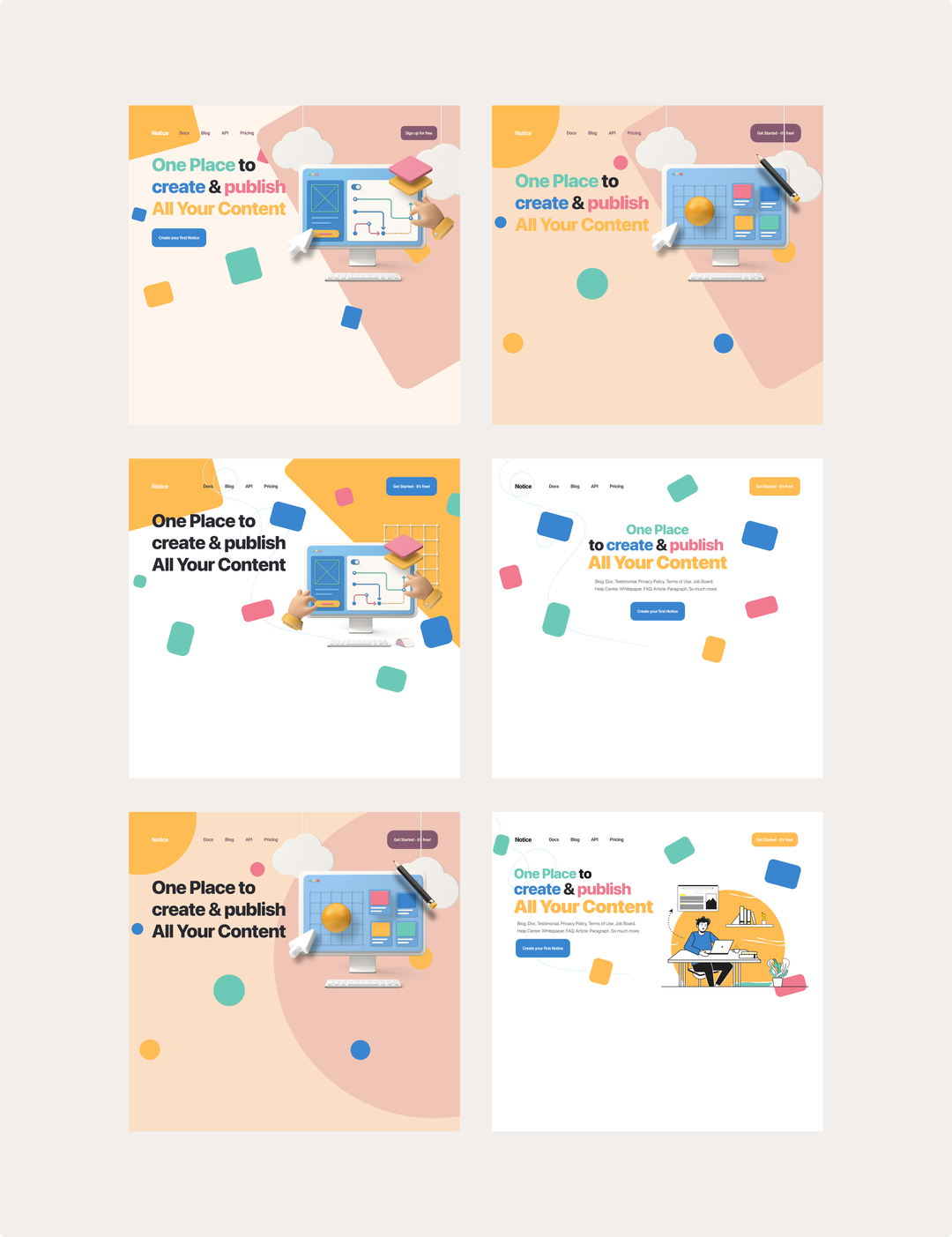
Everyone gave their input and in the end, we came with a final prototype. We managed to turn all the requirements we had into concrete design elements:
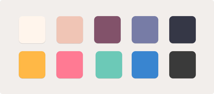
💎 Instead of bright colors, we opted for pastel tones to make the brand professional and trustful
🗺️ Our positioning stands out - we have blocks fitting everywhere. And this - single place - literally being the center of attention with the girl pointing the way to your solutions 😉
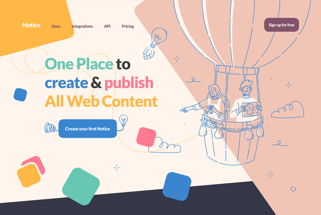
🧩 Add a flying bulb represented as a rocket and the multiple blocks around the screen, representing the block-like system.
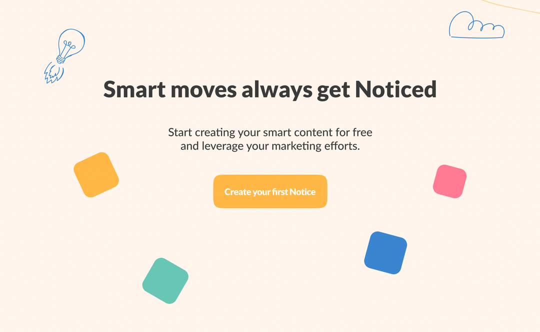
🧘🏼Use illustrations to transmit easiness and peace of mind
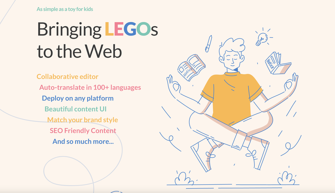
📷 The vivid colors and illustrations make it stand out from the crowd
The whole process took 2 weeks. And in the end, we didn’t just get a new website - we sat down and thought about what Notice meant to us.
This is just the beginning of a new age of content on the internet ✌️
